Home and Learn: Android Course
The Android ImageButton Widget
You can have a button that has just an image on, and no text at all. For this, there is a widget called ImageButton. With the ImageButton, you can change the image when the button is pressed. When it's not pressed it will revert to its normal state. Let's see how all of this is done.
First, download these three simple image: (Right-click, and save them to your own computer.)


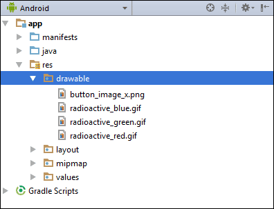
Save them to your computer and then copy and paste them into your drawable folder, just like you did for the warning button. Your drawable folder will then look like this:
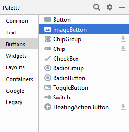
In the Palette, click on the Buttons category and locate the ImageButton:
Drag one of these onto your layout. When you let go of the left mouse button, you should see the Resources dialogue box appear:
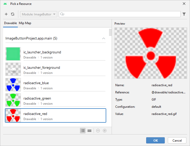
Select one of the images you copied to the drawable folder. We've selected radioactive_red. Click OK and you'll see the image appear on the button:

You could leave it like this, if you only want an image button. To get a different image depending on the button pressed state, though, you need to create an XML file. You then set a SRC property for the ImageButton. Let's create the XML file.
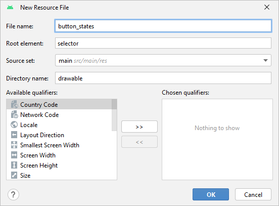
Right-click on your drawable folder in the explorer on the left. From the menu that appears select New then Drawable Resource File:
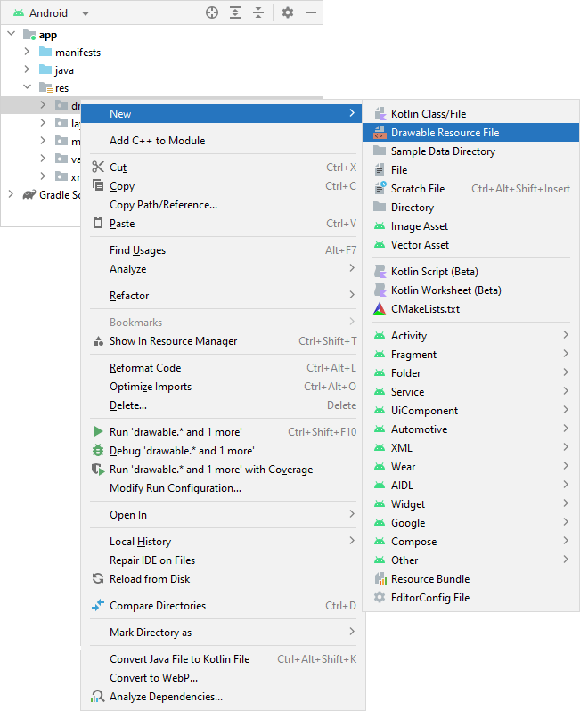
When you click on Drawable resource file you should see this dialogue box appear:
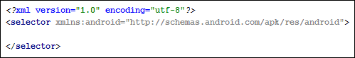
The idea is that you add new items between the two selector tags. Each item will have a different state. Don't worry, though, the AutoComplete feature of Android Studio makes adding the items quite painless.
Click your mouse before the </selector> tag. Type a left angle bracket and then the word item. Then tap the spacebar on your keyboard. You should see a list appear. From the list, select android:state_pressed:
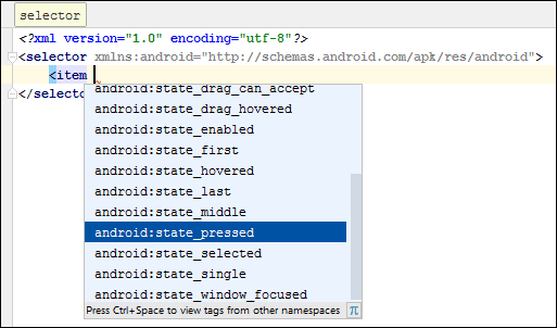
When you select state_pressed, you should see another list appear:
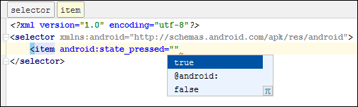
Select true from this list.
Type another space after the final quotation mark and select android:drawable from the list:
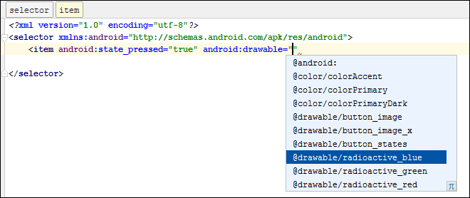
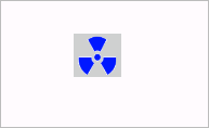
You should see the images you copied to your drawable folder appear on this list, right at the bottom. Scroll down and select an image to use as the pressed state. We've gone with radioactive_blue.
To complete the item tag, after the final quotation mark, type a space then a forward slash. After the forward slash, type a right pointy bracket. So this on the end:
" />
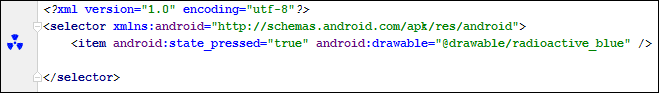
Your item tag will then look like this:
If you get it right, you should see a thumbnail of your image appear in the margins on the left.
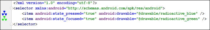
Now add a new item. This one should have the attributes android:state_focused="true" and android:drawable="@drawable/radioactive_green". Your XML will then look like this:
Again, if you get the XML right, you should see a thumbnail of your image in the left margins.
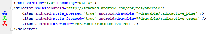
The final item is for the normal state. Here's the XML for you to add:
<item android:drawable="@drawable/radioactive_red" />
This time, you don't need a state attribute, just the drawable one. Here's what your code should look like:
When your XML file looks like ours, you can close it down because you're done with it.
You now need to set a SRC property for the button.
Click back on your activity_main.xml file. Make sure you are on the Design tab and not the Code tab. Click on your ImageButton to select it, if it's not already selected. Have a look at the properties area on the right, and scroll down to the bottom.
Expand the section that says All Attributes. Scroll down to the bottom of this new list and locate the srcCompat attribute:
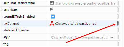
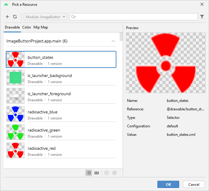
You will then see the Pick a Resource dialogue box appear:
Click OK on the dialogue box. You can now test it out. If your run your app in an Emulator, you probably won't see the focused state. But you will see the other two. The normal state will look like this:
Press/click the button and the image will turn blue:
Just a word on the images. We used 64 pixels by 64 pixel images. The format was PNG, but you can use GIF, if you need a transparent background. If you don't need a transparent background, then you can use JPEG images.
In the next lesson, we'll tackle Radio Buttons.
< Button Images and Text | Android Radio Buttons >
Back to the Android Contents Page